︎Branding ︎Web
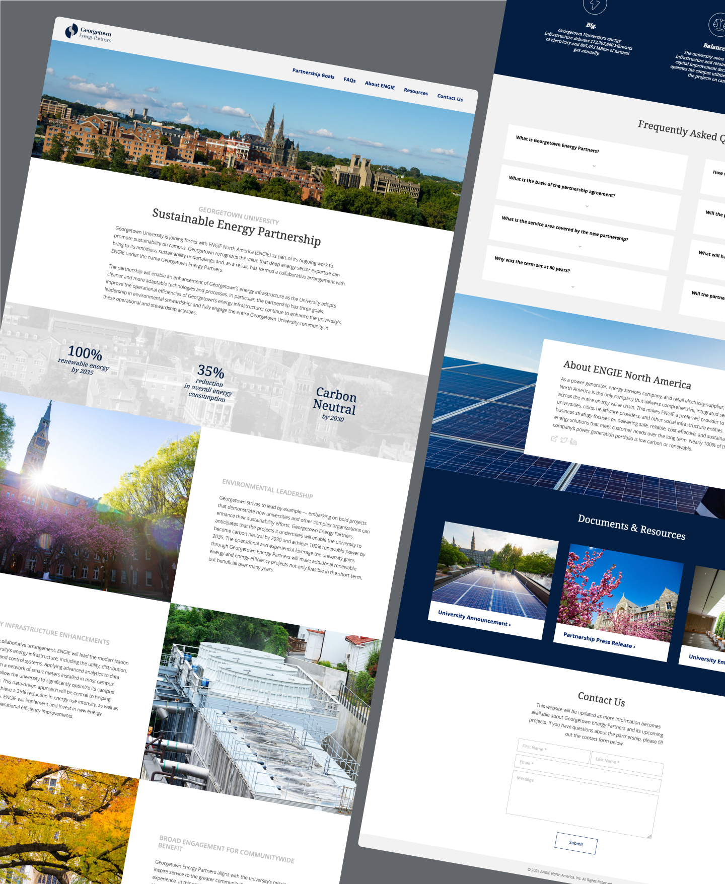
Our main objective for these deliverables was to represent the future Georgetown University pictured: where the institution’s careful management of its resources—especially energy—would intersect with educational opportunities and environmental stewardship. While designing the logo, we initially considered brighter accent colors to identify it as a separate entity and draw attention to Georgetown’s sustainability goals. However, to facilitate a smoother transition for students and staff affected by this change, we opted to harken back to familiar University colors for both the logo and landing page.
Before launching Georgetown Energy Partners, I worked with the University to establish a logo and landing page that would easily communicate the type of community and environmental impact it hoped to have.
Our main objective for these deliverables was to represent the future Georgetown University pictured: where the institution’s careful management of its resources—especially energy—would intersect with educational opportunities and environmental stewardship. While designing the logo, we initially considered brighter accent colors to identify it as a separate entity and draw attention to Georgetown’s sustainability goals. However, to facilitate a smoother transition for students and staff affected by this change, we opted to harken back to familiar University colors for both the logo and landing page.
Final Logo
![]()

Logo Sketching Process
![]()
![]()


Final Page Design
![]()

Landing Page Iterations
![]()
